- Pronouns
- He/Him
You are using an out of date browser. It may not display this or other websites correctly.
You should upgrade or use an alternative browser.
You should upgrade or use an alternative browser.
Handy-Dandy Artsy-Fartsy Critique Thread
- Thread starter TheOneMoiderah
- Start date
- Discussion Drawing

- Location
- in the trash
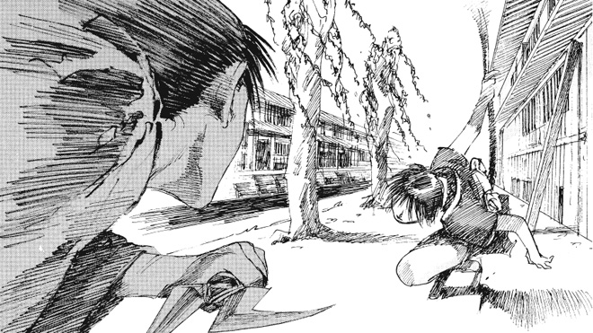
I am trying to draw this weeb style motion line shit for the first time

How is this supposed to work? How do you shade it?
I feel like the background should stay smooth while the character is blurred, but when I do that, it draws attention away from them. (See: HERE )
Hmm. The other way around? Blur the background but not the character? Only blur part of the character? (Note this is all guesswork on my part, I don't have any idea how to do motion blurs either)
- Pronouns
- He/Him
I've tried that before, but wasn't really satisfied with the sense of motion.Hmm. The other way around? Blur the background but not the character?
That might work with, say, legs during a run. Not so much with a leaping pose.Only blur part of the character? (Note this is all guesswork on my part, I don't have any idea how to do motion blurs either)
Well, selecting the right pose is part of this. I suck at setting up compositions.
- Location
- in the trash
That might work with, say, legs during a run. Not so much with a leaping pose.
Well, selecting the right pose is part of this. I suck at setting up compositions.
Since they're leaping, I think you could try only blurring the bottom half of the character while leaving the top half alone?
THAT IS BECAUSE YOU MOTION-BLURRED A FEATURELESS HALLWAY. PUT AN ACTUAL BACKGROUND IN THEREI've tried that before, but wasn't really satisfied with the sense of motion.
EDIT: PERHAPS A BAKERY
Biggest problem i see with the image, their's zero clarity on the left arm. It blends into the body, doesn't look like an arm, and it's part square for some reason? Because of this, the figure's profile doesn't read, and the pose isn't clear.I am trying to draw this weeb style motion line shit for the first time
How is this supposed to work? How do you shade it?
I feel like the background should stay smooth while the character is blurred, but when I do that, it draws attention away from them. (See: HERE )
What are they doing with their hands? I assume you are going for some DBZ style hand gestures, but they don't read because they're blended into the body.
Compare and Contrast with these
- Pronouns
- He/Him
They're meant to be aiming a big boxy rifle.Biggest problem i see with the image, their's zero clarity on the left arm. It blends into the body, doesn't look like an arm, and it's part square for some reason? Because of this, the figure's profile doesn't read, and the pose isn't clear.
What are they doing with their hands? I assume you are going for some DBZ style hand gestures, but they don't read because they're blended into the body.
Yeah, this is a whole different style of emphasis lines.
mite b good
I've been working on this for a few days now, and I'm fighting to make the pose both dynamic, and cool in a cute way
Something about it bothers me.

Apotheosis
Lucifer
- Pronouns
- She/Her
I've been working on this for a few days now, and I'm fighting to make the pose both dynamic, and cool in a cute way
Something about it bothers me.
My two cents: I think it's because there's a sort of difference in tension in the upper and lower bodies.
So like, the way the character's legs are bent and the way they're leaning leads me to think that the thing they're holding is pretty heavy, that there's no small amount of effort going into holding it up.
But, in the upper body, especially the arms, there doesn't really seem to be that tension. Like for example, to me the arms seem kind of noodly which conflicts with the angling of the legs and knees.
So you get this conflicting information, which is why it seems kind of off.
- Location
- Italy
Sooooo...opinions? What did i do wrong, what could i do better?
I'll probably color it...probably....maybe...I'll see.
Sooooo...opinions? What did i do wrong, what could i do better?
I'll probably color it...probably....maybe...I'll see.
You've created a classical perspective problem with the way you've angled the hips and shoulders in relation to themselves. We should not be able to see the left side of her breast, while also seeing the back of her arm. It's tilted too far, and shows too much of the right shoulder
Here's what I mean. The angle of the shoulders means her right arm is too far up.
 while
while
The left shoulder looks sorta dislocated
and I'm not sure if she's facing away or towards the viewer
Here's my art to critique
What feedback are you looking for on this? Is their something specific you'd like to improve?
- Location
- Connecticut
- Pronouns
- They/Them
What feedback are you looking for on this? Is their something specific you'd like to improve?
Shading around the body- I feel like I didn't do a really good job with it and was a little confused with my light source.
In that case, I'd say you've been too timid with your pencil work. Their's only a couple of really solid lines and what you need to be doing is getting a TON of graphite on the page. It doesn't need to be perfect, that will come as your eye grows stronger, but you cant build up value without putting it on the page.Shading around the body- I feel like I didn't do a really good job with it and was a little confused with my light source.
You want to fail as hard and as fast as possible, so you can improve quicker.
- Location
- Who Knows
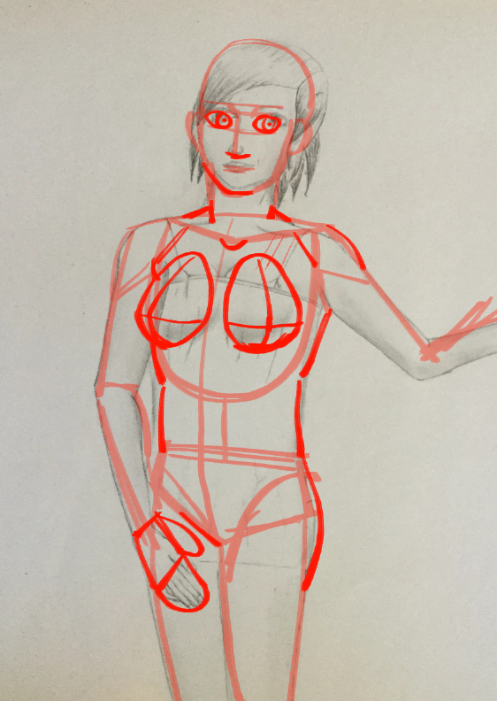
Since I actually do like giving crit, I probably should have been on this thread earlier lol, but hey! (Limited examples cause iPhone limitations)
Might be late but I did a rough framework thing to check out the anatomy of your figure @Lord Marshal and her left arm is definitely too far back to be comfortable. I think you have the face and left side of her torso facing to the side even though her back should be forward us looking at the rest of her body.
Edit: also maybe you want to think about the comfortability of how the leg bends.
I'm personally not as bothered by the right shoulderblade (because cloth), but the position of your spinal cord indicates the position that the rest of the body should be.
@djd
I can't manage to save/copy your image due to mobile shenanigans but something to consider for your lizard is nailing down the line of the spine first and then roughing out shapes of the body. (Circles/rectangles/triangles..)
Then moving on to the additional clarifying details you have here. This way you get a better sense of how the body is formed (the line of the spine or the line of the sternum-to-groin or both being the most important) and then you can get a better idea of how you want to shade the figure.
I do agree that putting more color in would help in terms of better knowing your strong suits and weak suits.
Might be late but I did a rough framework thing to check out the anatomy of your figure @Lord Marshal and her left arm is definitely too far back to be comfortable. I think you have the face and left side of her torso facing to the side even though her back should be forward us looking at the rest of her body.
Edit: also maybe you want to think about the comfortability of how the leg bends.
I'm personally not as bothered by the right shoulderblade (because cloth), but the position of your spinal cord indicates the position that the rest of the body should be.

@djd
I can't manage to save/copy your image due to mobile shenanigans but something to consider for your lizard is nailing down the line of the spine first and then roughing out shapes of the body. (Circles/rectangles/triangles..)
Then moving on to the additional clarifying details you have here. This way you get a better sense of how the body is formed (the line of the spine or the line of the sternum-to-groin or both being the most important) and then you can get a better idea of how you want to shade the figure.
I do agree that putting more color in would help in terms of better knowing your strong suits and weak suits.
Last edited:
- Location
- Connecticut
- Pronouns
- They/Them
I can't manage to save/copy your image due to mobile shenanigans but something to consider for your lizard is nailing down the line of the spine first and then roughing out shapes of the body. (Circles/rectangles/triangles..)
Then moving on to the additional clarifying details you have here. This way you get a better sense of how the body is formed (the line of the spine or the line of the sternum-to-groin or both being the most important) and then you can get a better idea of how you want to shade the figure.
I do agree that putting more color in would help in terms of better knowing your strong suits and weak suits.
Thanks for the advice- I started with the head and didn't really plot out the rest.
Now I suppose for some more in color (and hopefully easier to judge as a result). I'm not really happy with the legs
- Location
- Who Knows
Thanks for the advice- I started with the head and didn't really plot out the rest.
Now I suppose for some more in color (and hopefully easier to judge as a result). I'm not really happy with the legs
Huh! Can I ask about what you're drawing on? (Like tablet, or art program...)
But actually from what I'm seeing, you don't have a terrible sense of coloring and shading. I think you might rely on White as your light source too much, but the lights and darks are all pretty well rendered.
...what's kind of not your strong suit in here is the anatomy I think. The shapes you're working with are a bit off, and studying anatomy would really help you I think.
The breasts are kind of disembodied from the torso and look like random bumps. Breasts pretty much originate on the pectoralis origin, so they should start being a thing at the edge of the deltoid/collarbone, and the collect into a more rounded shape moving downward. Gravity would drag them down without bras etc etc blah.
The neck doesn't look super connected to the head, keep in mind that the neck should begin right under the ears, so while there's room for stylistic interpretation, it's probably not that thin, especially when you're working towards a more realistic figure.
The face is oddly shaped too. It's a little flat, so stuff to keep in mind is the dimensions that faces can have, cheeks can be hollow, cheekbones can be pronounced, The nose is probably more outwards as well as the forehead. If you feel the sides of your face, your temples are pretty flat, so some more careful shaping so the sides aren't as round would be better. Be careful about the hairline, cause I can't tell if the hairline is sloping super badly, or if those are non-properly rendered bangs.
The legs might be feeling off due to the lack of hips? They're thin so I can't immediately assume that they should be wider at the thighs rather than the hips, but treating the thigh and calves portions as separate shapes would be useful. The fold of pant cloth seems arbitrary. Keep in mind that fabric creases where it hits bends. Which part of the body tends to bend? The groin/thigh junctions, the knees, ankles....etc. (also applying to upper body but that's not the focus here.)
Your arms aren't actually too bad, but learning more anatomy would probably help with learning to draw them more confidently too.
I'm assuming that she's walking through water in which case the water would have a reaction to the movement. Where her legs and the water meet probably send off ripples.
I think that's about it?
Hello world.
As a prefix, I am rather (read very) new to the whole art thing .
So, I'd appreciate it if you "rip this to shreds" in terms of critique; All tips and tricks would gladly be appreciated.
I have a particular piece which I've been working on for a couple of days but haven't a clue on how to properly shade it, it looks very flat: I had a gander at tutorials on YouTube but i'd quite like some feed back on it.
(Also very unsure as how to upload an image directly to SV?)
Last edited:
- Location
- Connecticut
- Pronouns
- They/Them
I'm using GIMp and just sketching it out on paper- I don't have a tablet or anything like that.Huh! Can I ask about what you're drawing on? (Like tablet, or art program...)
yeah, I think I was a little conservative with the shading on the face
Thanks for the anatomy help- much appricated
- Location
- in the trash
I'm using GIMp and just sketching it out on paper- I don't have a tablet or anything like that.
yeah, I think I was a little conservative with the shading on the face
Thanks for the anatomy help- much appricated
Drawing with a mouse is really tricky, in my experience. I think it might be good to post some of your pencil sketches here.
(Also GIMP is generally good for image editing, but there are some issues that cause pretty severe latency when you try to use it with a tablet.
If you do get a tablet, try to find some painting software with better tablet integration--Photoshop is the industry standard, but there are quite a few programs that don't cost several hundred dollars and should still be sufficient for your needs)
Last edited:
So after a few years of not much art, I decided to pick it back up last...September, I think? Probably not the best choice to start a time consuming hobby in a stacked year of high school, but eh. I guess I got through it?
First, sorry for the phone camera picture.
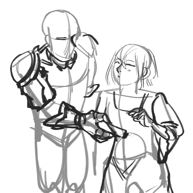
Question one: What type of predrawing skeleton is the best for a sense of depth? I used to use ovals, but the proportions always seemed a bit off, even when drawing in a stylized weebish style. I used a primarily rectangle-based skeleton for this drawing, but that ended up with a very not three dimensional look when the two figures interact. Like I have no idea what's going on with his right and her left shoulder, but I know it's not correct.
Question two: How do I add feeling of weight and thickness for clothes and armor? It looks a bit overly thin the way I draw it right now.
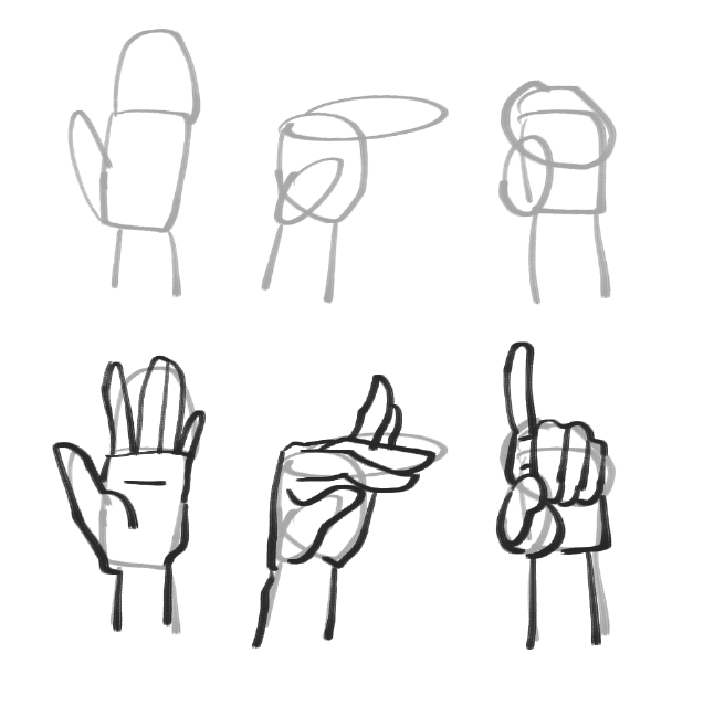
Question three: Hands. How do they work? I can draw closed hands and completely opened hands. Everything in between is a crapshoot. Even if it ends up looking fine, I don't really know how I made it work. Is there any recommended way to draw a skeleton for a hand's structure?
Question four: How does the proportions for the bodies look? Looking at this picture, I think I made the heads a bit too large, but other than that?
Question five: Any other recommendations? Thanks.
Sorry for writing so much.

First, sorry for the phone camera picture.
Question one: What type of predrawing skeleton is the best for a sense of depth? I used to use ovals, but the proportions always seemed a bit off, even when drawing in a stylized weebish style. I used a primarily rectangle-based skeleton for this drawing, but that ended up with a very not three dimensional look when the two figures interact. Like I have no idea what's going on with his right and her left shoulder, but I know it's not correct.
Question two: How do I add feeling of weight and thickness for clothes and armor? It looks a bit overly thin the way I draw it right now.
Question three: Hands. How do they work? I can draw closed hands and completely opened hands. Everything in between is a crapshoot. Even if it ends up looking fine, I don't really know how I made it work. Is there any recommended way to draw a skeleton for a hand's structure?
Question four: How does the proportions for the bodies look? Looking at this picture, I think I made the heads a bit too large, but other than that?
Question five: Any other recommendations? Thanks.
Sorry for writing so much.
- Location
- Connecticut
- Pronouns
- They/Them
you might want to try shading in the shadows a bit more- that might help with defining how the parts interact with each other
- Location
- in the trash
skeleton is the best for a sense of depth? I used to use ovals, but the proportions always seemed a bit off, even when drawing in a stylized weebish style.
Cylinders.
- Location
- Who Knows
Hello world.
As a prefix, I am rather (read very) new to the whole art thing .
So, I'd appreciate it if you "rip this to shreds" in terms of critique; All tips and tricks would gladly be appreciated.
I have a particular piece which I've been working on for a couple of days but haven't a clue on how to properly shade it, it looks very flat: I had a gander at tutorials on YouTube but i'd quite like some feed back on it.
(Also very unsure as how to upload an image directly to SV?)
First things first, the torso immediately strikes me as too long, and the space between the pecs might be a little wide? I also note that the bellybutton isn't lined up with the sternum, which it should be, even if the body is twisted, because the spine and the sternum-to-crotch are important lines of the figure. (those lines can be curved/twisted, but they need to be there) Also, try to draw the feet, even as triangles because they give a good sense of where the character is putting their weight and are just good to keep in mind. Practice means perfect.
As for shading it's not bad. I think more emphasis on the crevices of the body being darker would give some more dimension, as well as deciding on where your light source is. If it's from the side-ish as it seems to be, the leg in the front would be slightly hit by that light on the side, so that may be a place to look at.
People upload images directly here by putting an image on a site first like imgur, and then inserting the image url into preexisting insert images button I believe.
1: I've skipped a few steps due to my experience, so this may not be entirely helpful, but I go with a framework first. Get the head (roundish oval) horizontal lines for the shoulders and hips, and then mostly stickfigure-esque lines to suggest direction of limbs/body parts/spine. One thing that might help or not, is using those lines to suggest the contours of the figure rather than the center and also TEARDROP shapes are also good. Then getting more important contour lines like crotch lines and collarbones, and then extending shapes from those landmarks. I tend to work more linear first, the framework I did earlier shows my basic skeleton, and then I add onto those in loose lines.So after a few years of not much art, I decided to pick it back up last...September, I think? Probably not the best choice to start a time consuming hobby in a stacked year of high school, but eh. I guess I got through it?
First, sorry for the phone camera picture.
Question one: What type of predrawing skeleton is the best for a sense of depth? I used to use ovals, but the proportions always seemed a bit off, even when drawing in a stylized weebish style. I used a primarily rectangle-based skeleton for this drawing, but that ended up with a very not three dimensional look when the two figures interact. Like I have no idea what's going on with his right and her left shoulder, but I know it's not correct.
Question two: How do I add feeling of weight and thickness for clothes and armor? It looks a bit overly thin the way I draw it right now.
Question three: Hands. How do they work? I can draw closed hands and completely opened hands. Everything in between is a crapshoot. Even if it ends up looking fine, I don't really know how I made it work. Is there any recommended way to draw a skeleton for a hand's structure?
Question four: How does the proportions for the bodies look? Looking at this picture, I think I made the heads a bit too large, but other than that?
Question five: Any other recommendations? Thanks.
Sorry for writing so much.
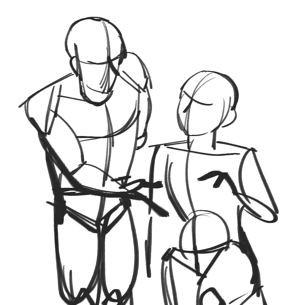
5: Something to consider is working lighter overall, so you have reemphasize the body contour lines, so the separate nature of the two figures is more obvious.
you might want to try shading in the shadows a bit more- that might help with defining how the parts interact with each other
Hands should be bigger I think, and eyes are kind of too close to the edge of the head, and unfocused. They aren't looking in the same direction. Chin feels a little weak, careful about how jawlines work.
ALRIGHT. That's it for now. boy that took some time.
Fletcher
Process to process/ the halting of pace
- Location
- Philippines
... Is this thread still open? Because it looks like no-one's posted for a while...
But if it is, can someone critique this drawing I made? I'd like to get it fixed up before using it if there's anything wrong. The lighting feels a little... off.
But if it is, can someone critique this drawing I made? I'd like to get it fixed up before using it if there's anything wrong. The lighting feels a little... off.
