-
For all readers and writers
After much ado, our new tagging system is here and being rolled out to the userbase. Read more here!
You are using an out of date browser. It may not display this or other websites correctly.
You should upgrade or use an alternative browser.
You should upgrade or use an alternative browser.
More Filth - An Emporium of Art, Pseudoscience, and Ice Cream Koans
- Thread starter Falchion
- Start date
- Location
- National Capital Region, USA
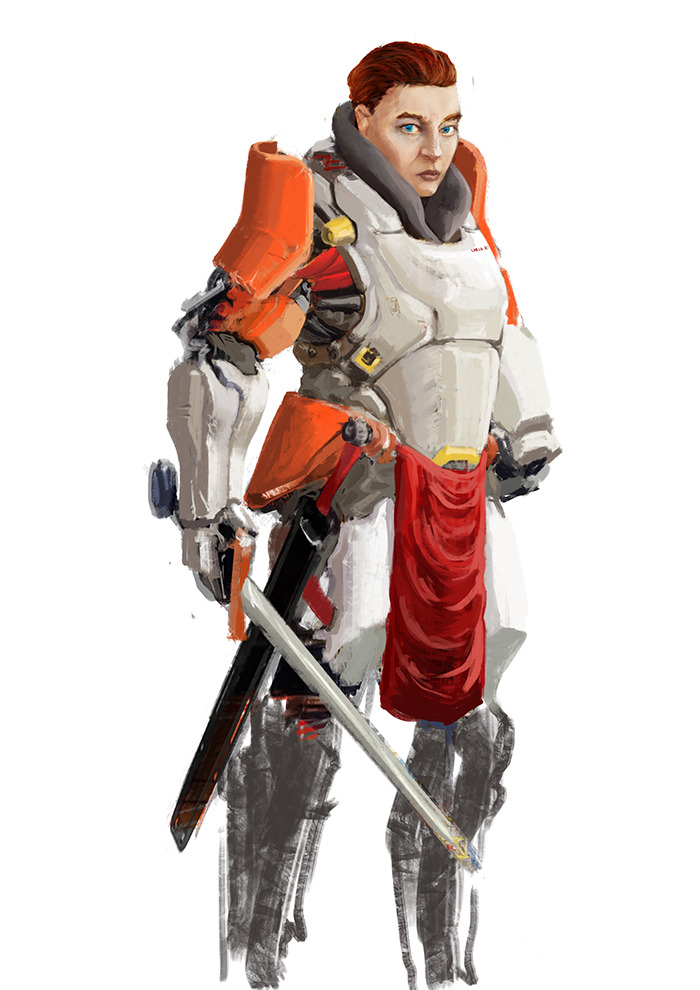
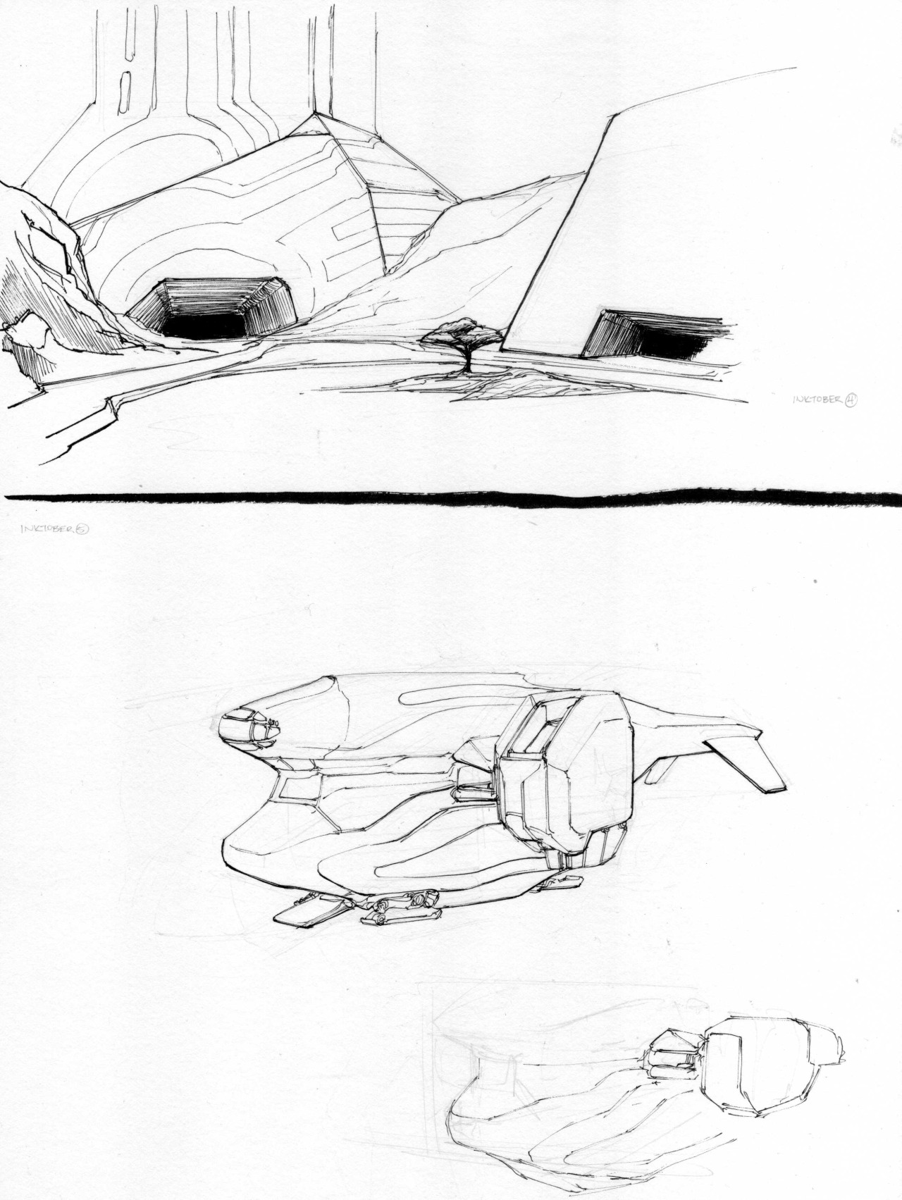
It's the strangest combination of 'looks like legit tech-impact armor that can seal up for space' and 'it's the 13th Century and I'm about to fuck you up'.
And yet my prototype sketch from two years back...doesn't look like either of those at all.It's the strangest combination of 'looks like legit tech-impact armor that can seal up for space' and 'it's the 13th Century and I'm about to fuck you up'.


- Location
- National Capital Region, USA
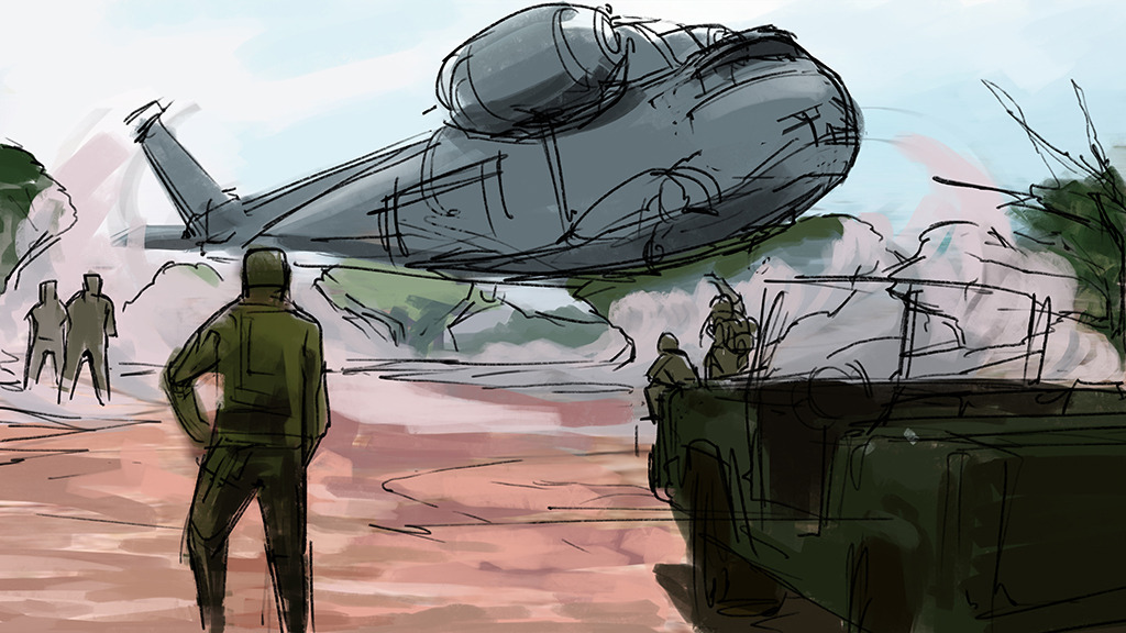
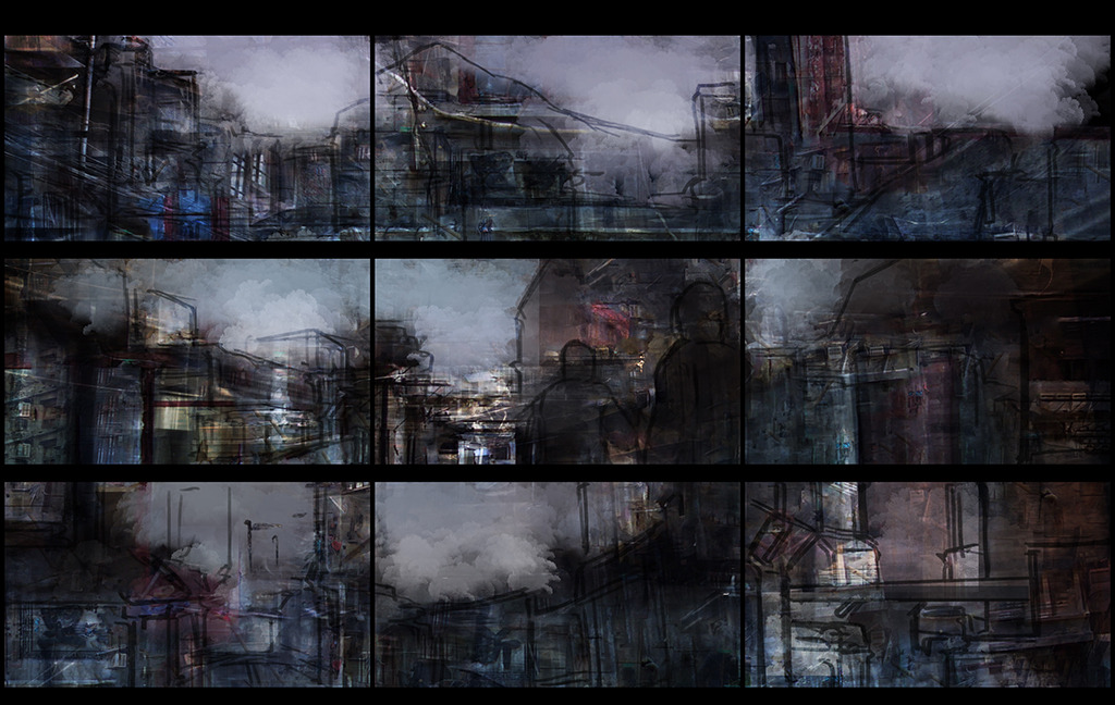
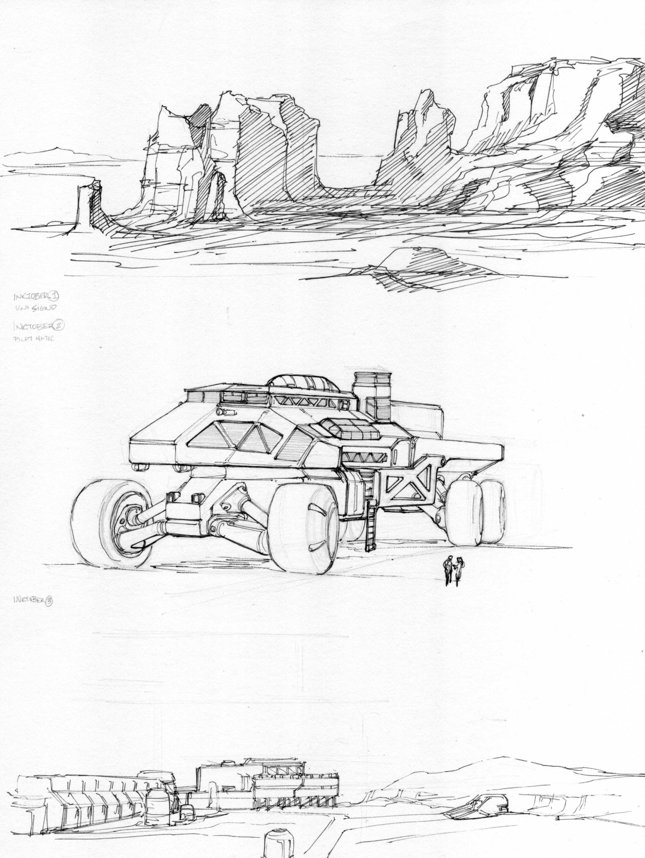
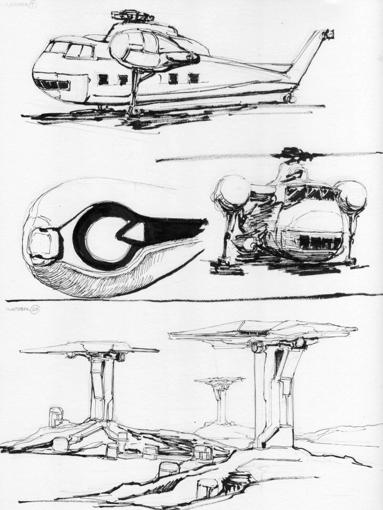
Nice and atmospheric. Like backgrounds for Blade Runner 2.
- Location
- National Capital Region, USA
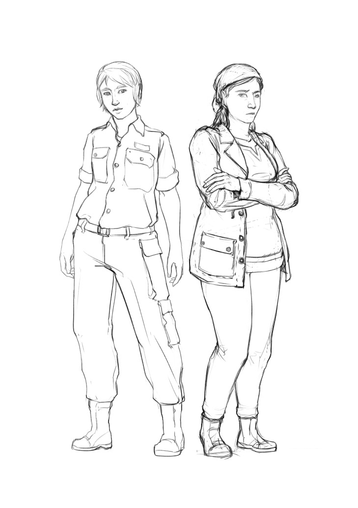
Looks pretty practical, though the feet are a little strange. Why the toes?
- Location
- Earth
Heya Falchion, just popping out of lurk to say, I really quite admire your sense of scene composition/camera work in your environment/scene pieces. Any chance we'll see some more rendered/finished environment concepts, or do you tend to prefer sticking to more rough/painterly finishes? Anyway, keep up the good work!
- Location
- National Capital Region, USA
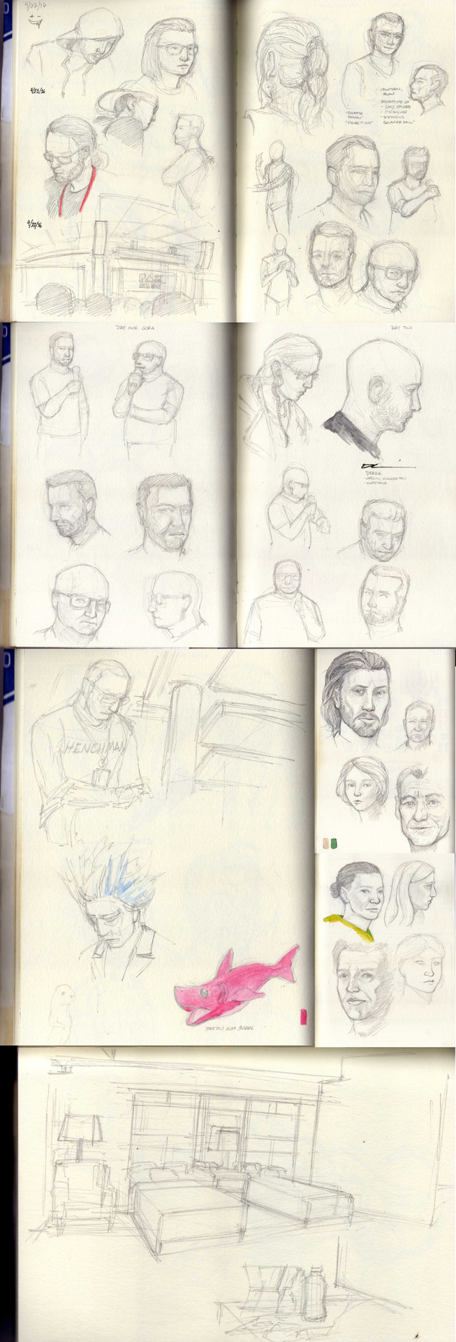
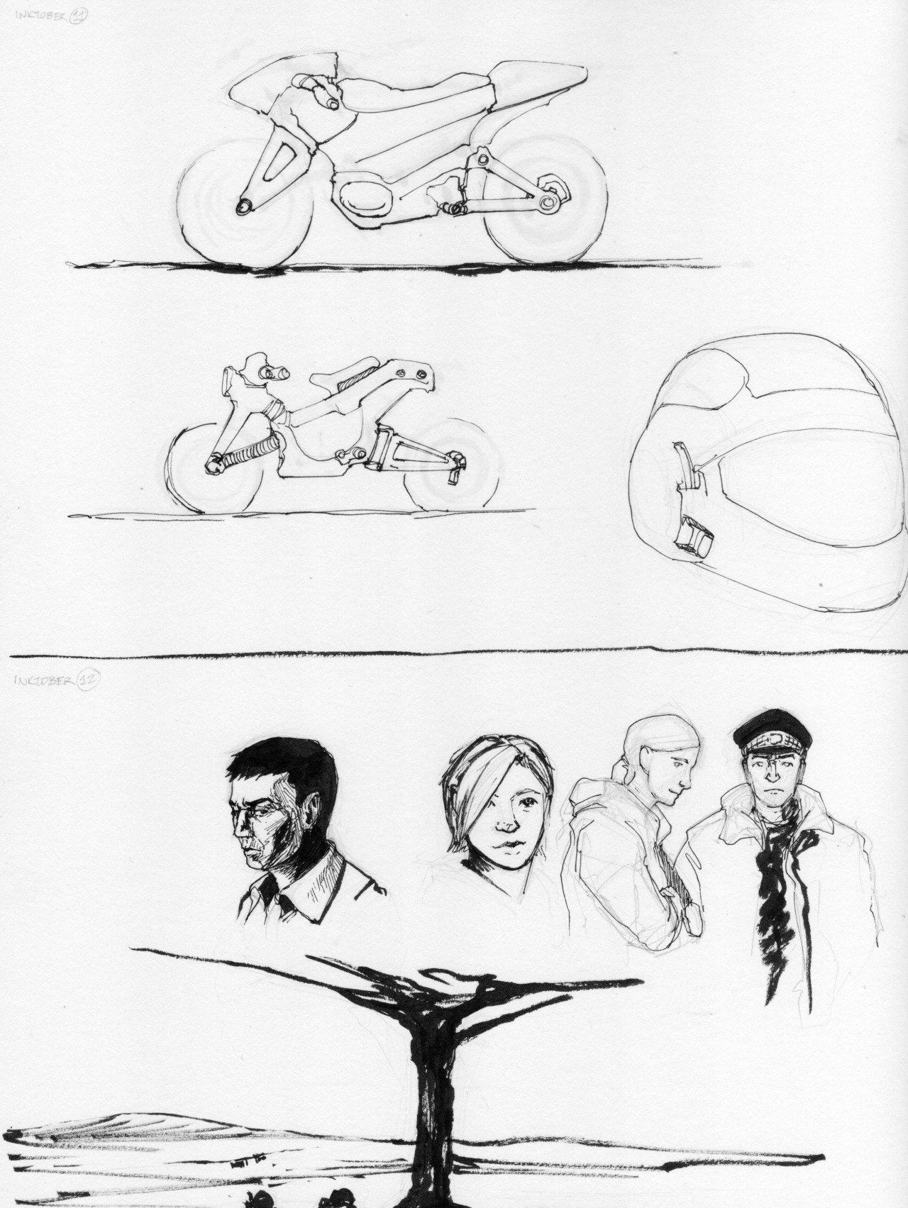
Faces faces faces faces... PINK SHARK!

Cornuthaum
Be kind to each other.
- Location
- Austria
- Pronouns
- He/Him
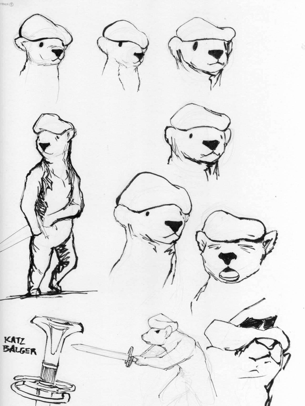
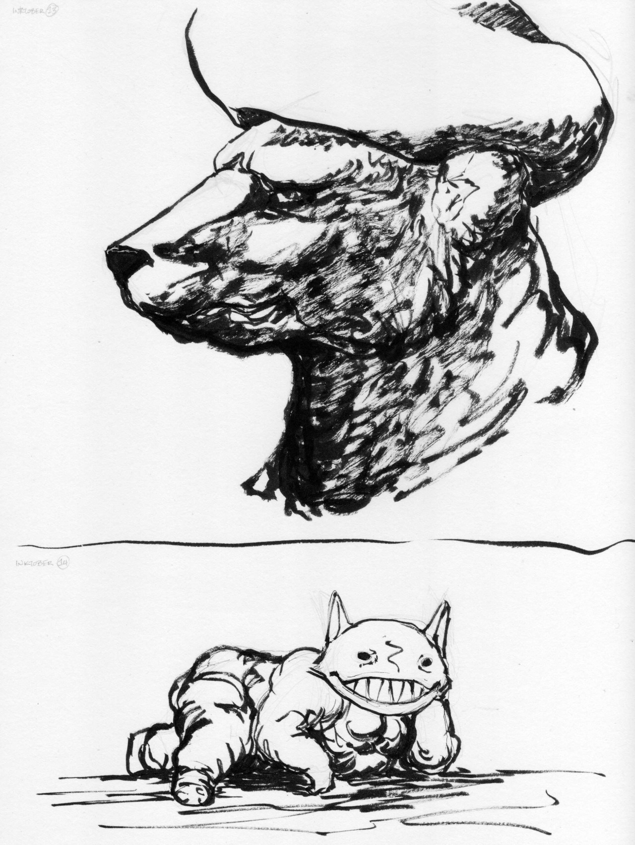
I came by to check to see if you had posted The Youth of von Frundsbär and am happy to see that you did.
Because, no shit, I love your bears.
Because, no shit, I love your bears.
Cornuthaum
Be kind to each other.
- Location
- Austria
- Pronouns
- He/Him
"And so, with age, the creature grows degenerate... like that. *waves a paw*"
- Location
- National Capital Region, USA
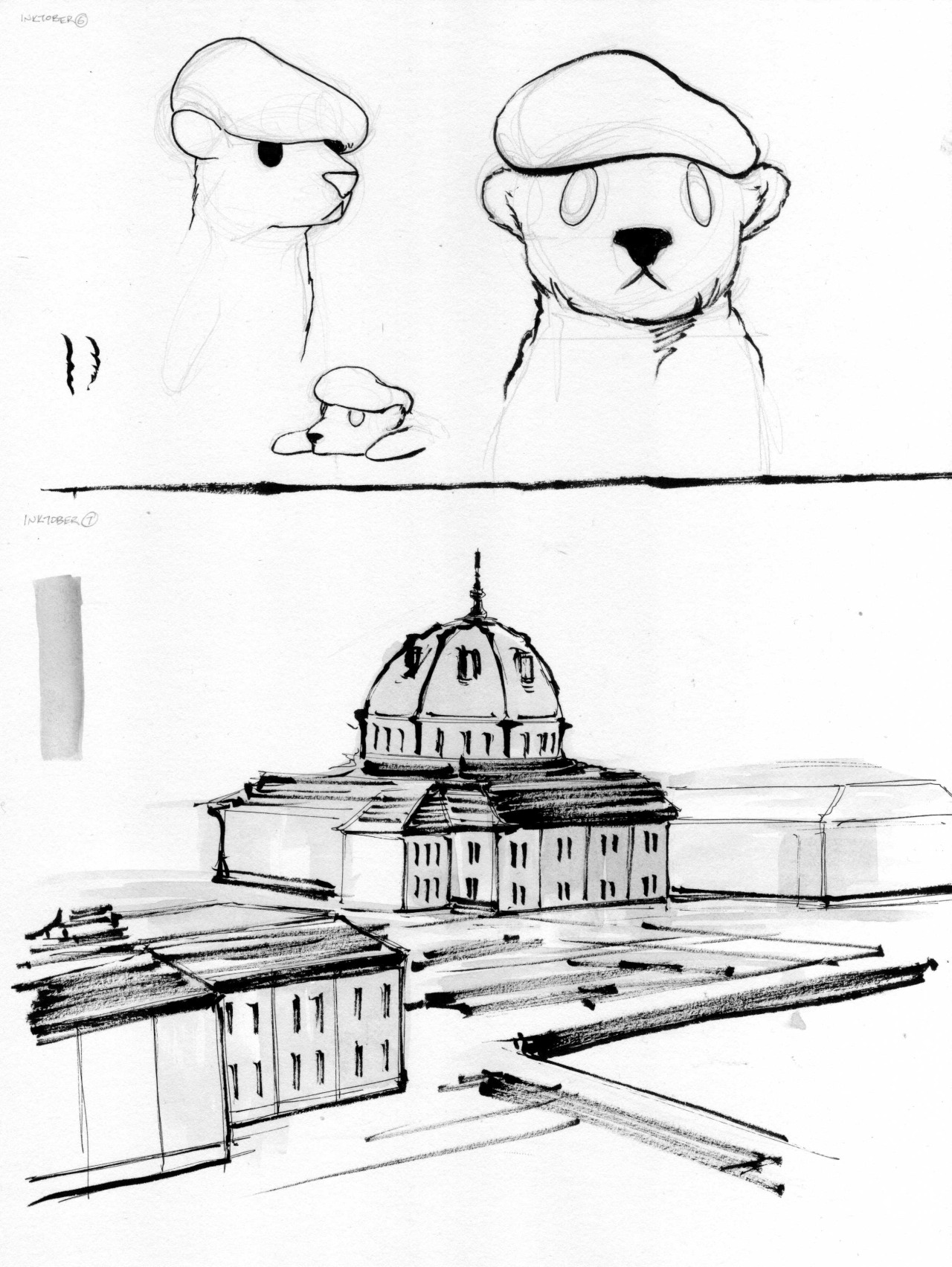
We have discovered Lt Growlsky's ancestors!
Burning Baron
This position needs more entrenching.
- Location
- In here, not out there.
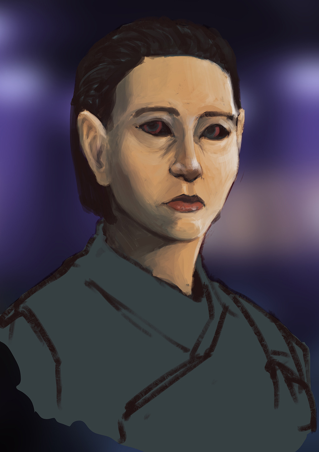
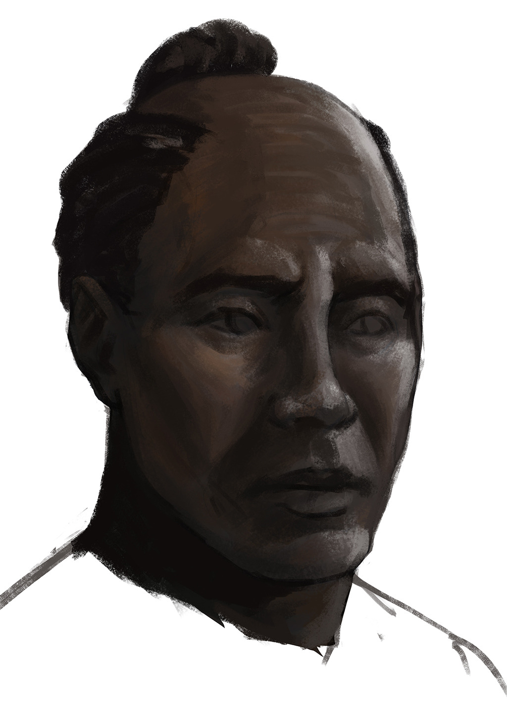
He looks a little like Don Cheadle.
- Location
- National Capital Region, USA
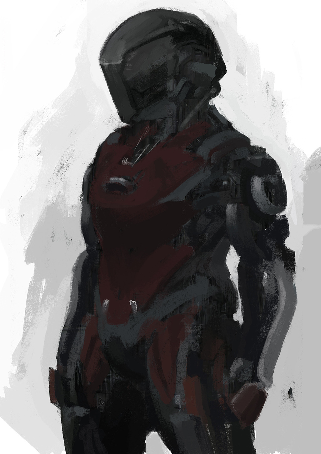
That is really nice, like, magazine cover or major ad poster good.
The trick is to use a brushy-enough brush that it'll razzle-dazzle people enough to realize that you aren't paying enough attention to the values. Also, smart-fill seems to have become a standard tool for me to set up the "underpainting." And if all else fails, never let them see you bleed.That is really nice, like, magazine cover or major ad poster good.